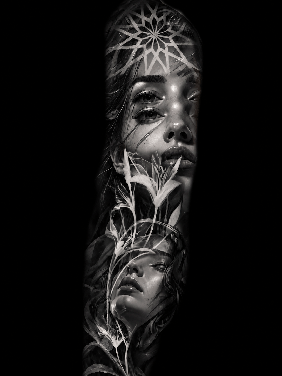
A dark realism tattoo should feel like it belongs to you, not like an image lifted from a wall. This dark realism design guide is for turning a mood, memory, fear, belief, or personal symbol into black and gray work with depth, movement, and a clear place on the body.
The strongest pieces are rarely built around one cool reference alone. They come from a central idea, then use realism to make that idea believable: the wet texture of a raven’s feathers, the worn stone of a statue, the light in an animal’s eye, or a face emerging from shadow. Detail matters, but it only works when the composition has something to say.
Start With the Story, Not the Subject
People often begin with a subject: a wolf, a Viking warrior, a skull, a forest, a horror figure. That is a useful starting point, but it is not yet a design. Ask what the subject represents and what feeling the tattoo should carry from a distance.
A wolf can be about protection, survival, solitude, family, or the version of yourself that refuses to be controlled. A Viking-inspired composition can lean toward heritage, conflict, endurance, or myth. A horror-inspired piece may be less about a specific character and more about obsession, mortality, or confronting something dark.
This matters because meaning guides every visual decision that follows. A protective animal may need a steady forward gaze and a grounded posture. A design about loss may feel stronger with a partially obscured face, bare branches, smoke, or negative space. The imagery should support the story rather than compete with it.
Write down a few words before collecting references. Not a long explanation, just the emotional core. For example: “calm strength after chaos,” “my connection to the sea,” or “a reminder to keep moving through fear.” That gives the design a direction that a folder full of random tattoo screenshots cannot.
Dark Realism Design Guide: Build One Clear Focal Point
Dark realism can become visually crowded very quickly. Realistic fur, faces, armor, forests, clouds, lettering, clocks, and skulls all carry texture. If every area asks for equal attention, the tattoo loses impact.
Choose one focal point that should read first. On a sleeve, it may be an animal’s face at the upper arm or a portrait positioned where the arm naturally turns toward the viewer. On a backpiece, it may be a central figure framed by architecture, wings, trees, or smoke. Everything around that focal point should create support, depth, or transition.
A good composition gives the eye a path. It might move from a face into dark fog, then toward a smaller symbolic object near the forearm. It might begin at a raven’s head, follow the wing structure across the shoulder, and settle into a forest below. That movement makes a large tattoo feel intentional when viewed as a whole.
Think about the design in three levels: the main image seen from across the room, the supporting elements noticed at conversational distance, and the fine details discovered up close. If the tattoo only works in a close-up photo, it may not work as well on skin.
Let the Body Shape the Composition
A custom tattoo is not a flat illustration. The arm bends, muscles shift, the shoulder curves, and the back has a wide visual field that changes depending on posture. Placement should influence the idea early, not after the drawing is finished.
Portraits, animal heads, and masks often benefit from areas that offer a broad, stable surface. The upper arm, outer forearm, thigh, chest, and back can give a face room to breathe. Long forms such as swords, trees, serpents, or wing structures can create natural flow through a sleeve or along the calf.
For a sleeve, avoid treating each section of the arm as separate framed images. The shoulder, bicep, elbow, forearm, and wrist need transitions. Smoke, shadows, branches, water, fur, stone, and fabric can connect major elements without looking like filler. The elbow deserves special consideration because it moves constantly and naturally breaks up detail. A design can work with that movement rather than fighting it.
Large-scale work gives dark realism the room it needs. Tiny realism can be striking, but it limits texture, contrast, and long-term clarity. That does not mean every idea needs to become a full sleeve. It means the amount of detail should match the available skin.
Use References for Direction, Not Duplication
References are essential in realism. They show anatomy, lighting, textures, expressions, historical materials, and the atmosphere you are drawn to. They should help build a personal design, not become a request to duplicate another person’s tattoo or artwork.
Bring references in categories. One image may show the animal’s expression you want. Another may have the lighting or shadow level that feels right. A third may capture a landscape, helmet, statue, or type of texture. Personal photos, family objects, places, and meaningful symbols can add the details that make the final concept yours.
It also helps to explain what you do not want. Maybe you like ravens but do not want a fantasy illustration. Maybe you want Viking imagery without a costume-like look. Maybe you want horror influence but not an obvious movie poster. Clear boundaries are as useful as visual inspiration.
Contrast Is What Makes Black and Gray Work
Dark realism is not simply a tattoo made with dark subject matter. It is a careful balance of blacks, soft gray tones, open skin, and controlled highlights. The contrast is what gives the work its atmosphere and makes forms readable over time.
Deep black creates weight. It can push a background backward, frame a portrait, separate feathers, or give smoke a sense of density. Softer gray wash builds volume in skin, clouds, fur, stone, and fabric. Small areas of untouched skin or light highlights create the sharpest visual moments.
The trade-off is simple: too much darkness can make a design feel heavy and lose detail as it settles; too little black can leave realism looking washed out and flat. The right balance depends on skin tone, placement, subject matter, and how much visual intensity you want.
Do not be afraid of negative space. Open areas are not unfinished areas. They give the darker passages room to breathe and help the tattoo remain readable. In a forest scene, for example, a lighter mist behind the trees can make the foreground feel deeper than adding more trees ever could.
Choose Details That Will Age With the Piece
The smallest details are often the first things clients notice during the design stage. They are not always the details that matter most years later. Realism needs enough space between forms for shadows, lines, and textures to stay distinct as the tattoo heals and settles.
A skilled design adjusts detail to the scale and placement. Tiny individual hairs may be suggested rather than drawn one by one. Fine cracks in stone may be simplified. Background architecture may become softer as it moves away from the focal point. These choices are not compromises in quality. They are part of designing for skin instead of paper.
If a concept includes text, dates, or small symbols, keep them purposeful. A short word or clean Roman numeral can add meaning. Too many small elements can weaken the larger composition and make future readability harder.
Make Large Projects Feel Connected
For sleeves, backpieces, and multi-session work, planning ahead protects the final result. You do not need every square inch designed before the first session, but you do need a strong framework. Decide where the focal point belongs, which areas should remain open, and how the major visual themes will continue across the body.
A nature-based sleeve might move from a powerful animal at the shoulder into mountain forms, weather, and dark pines toward the forearm. A mythology piece may use a central warrior or god, then connect symbols through carved stone, runes, ravens, ships, or storm clouds. The supporting elements should feel like part of the same world.
This is also where patience matters. A large tattoo benefits from sessions that allow the artist to build depth carefully rather than forcing every detail into a rushed design. The result should feel unified, not assembled from separate ideas over time.
Bring a Strong Idea, Then Leave Room for Artistry
The best client-artist collaboration has both direction and trust. Bring the story, the subjects that matter, placement ideas, useful references, and any must-have details. Then leave room for composition, lighting, scale, and the artistic decisions that turn those ingredients into a tattoo that works on your body.
At Dimitris Steiger, the goal is not to fit your idea into a pre-made template. It is to shape it into a custom black and gray realism piece with presence, technical control, and a feeling that lasts beyond the first look. A design becomes more personal when every shadow, transition, and focal point has a reason to be there.
The right dark realism tattoo should still speak to you when the details become familiar. Start with the part of your story that has weight, and let the artwork give it a form worth carrying.