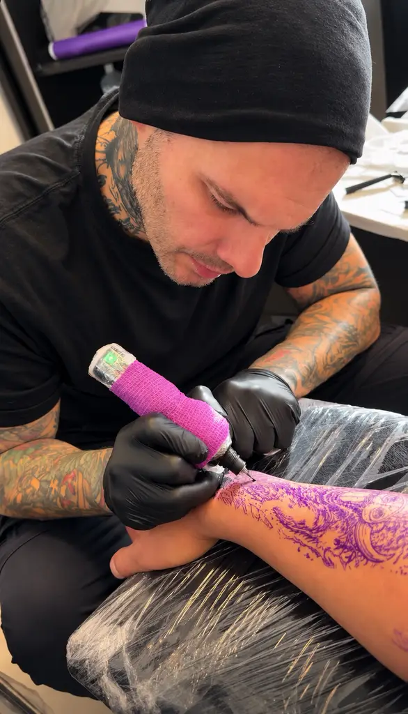
A realistic tattoo is not just a detailed image placed on skin. The best work feels intentional from every distance: strong from across the room, convincing up close, and personal long after the first excitement has settled. If you are searching for a realistisk tatuering Göteborg with Dimitris Steiger, the goal should be more than finding a familiar motif. It should be creating a piece that belongs to you.
Black and gray realism has a particular power when it is built around a story. A wolf can represent protection, instinct, family, or the feeling of surviving something difficult. A Viking portrait can connect to heritage, mythology, strength, or a personal code. A horror-inspired design can be cinematic and dark without becoming a copy of a poster. The subject matters, but the interpretation matters more.
What makes realism feel alive on skin
Realism depends on more than technical detail. Smooth shading, controlled contrast, texture, and anatomy all play a role, but they need to work together. Skin is not a flat sheet of paper. It moves, curves, changes tone, and ages over time. A design that looks impressive as a small digital reference may need a different composition to read clearly on an arm, chest, thigh, or back.
That is why black and gray realism is often strongest when it has room to breathe. Soft transitions create depth. Deep blacks establish structure. Carefully preserved skin breaks can suggest reflected light, wet eyes, fur, metal, smoke, or aged stone. Fine details give the viewer something to discover, but the larger values are what keep the tattoo readable years later.
A realistic piece should also have a clear focal point. In a portrait, that may be the eyes. In an animal design, it could be the face breaking through shadow. In a larger narrative composition, the focal point guides the eye through the scene instead of forcing every element to compete for attention.
Realistisk tatuering Göteborg: start with the story
Clients often arrive with several saved images, a favorite animal, a historical reference, or a loose idea of the mood they want. That is a good starting point, not a finished tattoo brief. The custom process is where separate references become one coherent composition.
Start by thinking about the feeling you want the tattoo to carry. Do you want something calm and stoic, brutal and dramatic, spiritual, mournful, or protective? A raven, forest, compass, helmet, skull, or figure can take on entirely different meaning depending on its expression, lighting, placement, and surrounding elements.
For example, a black and gray bear tattoo can be a clean portrait with sharp fur detail and a direct gaze. It can also be part of a larger wilderness scene, emerging from fog beneath mountain lines and pine branches. Neither option is automatically better. The first may suit someone who wants a powerful, focused statement. The second may suit someone building a sleeve with a broader personal narrative.
The most successful custom tattoos avoid adding symbols simply because they are popular. A meaningful object, landscape, date, or texture can strengthen a concept. Random filler can make an otherwise strong piece feel crowded. Good composition is often about knowing what to leave out.
Large-scale work creates more possibilities
Sleeves, backpieces, and larger leg projects give realism the space it needs for atmosphere and flow. They allow a portrait to sit inside a wider scene, with transitions that follow the body rather than ending abruptly at the edge of a single image.
A full sleeve does not need to be designed as one solid wall of ink from the beginning. It can be planned in stages, as long as there is a clear long-term direction. Background textures, smoke, shadows, architecture, natural elements, and negative space can connect individual scenes into one visual language.
There is a trade-off. Large-scale work asks for patience, commitment, and a willingness to let the design develop over multiple sessions. In return, it offers a level of depth that a small, highly compressed design cannot always achieve. If you want a face, animal, or scene to hold fine expression and realistic dimension, more space is usually an advantage.
Designing for placement, not just the reference
Placement changes everything. An image that works beautifully on the outer forearm may need a different crop or angle for the calf. The upper arm can carry a rounded composition well, while the chest often benefits from a design that responds to the centerline and natural movement of the body.
A good tattoo design considers how you stand, move, and see the piece in everyday life. It should not only look right in one carefully posed photo. This is especially relevant for portraits and animal heads. A small shift in angle can make a face feel more natural, more imposing, or more connected to the body’s shape.
Visibility is another personal decision. Some clients want their realism tattoo to be seen every day on the forearm or hand area. Others prefer a placement that feels more private, such as the upper arm, thigh, back, or chest. There is no universal right answer. The best placement balances the scale your idea needs with how you want to live with it.
The value of custom black and gray realism
A custom tattoo is not about choosing an image from a wall and reproducing it exactly. It is about translating your references into artwork designed for your skin, your placement, and your story. That process protects the originality of the piece while giving the artist room to make decisions that improve contrast, longevity, and visual flow.
Dimitris Steiger approaches realism with that balance in mind: detailed enough to reward a close look, structured enough to remain powerful from a distance. The work is rooted in black and gray realism, dark atmosphere, and carefully built compositions rather than quick trends or generic flash-first ideas.
This does not mean every tattoo needs to be heavy or dramatic. Black and gray can be subtle, quiet, and deeply personal. A memorial design may call for softness and restraint. A mythological scene may need bold contrast and a darker edge. The style should serve the person wearing it, not the other way around.
Come prepared, but stay open to direction
References are valuable when they communicate mood, subject matter, texture, and placement preferences. Bring images that show what you respond to, then explain why you respond to them. Maybe it is the lighting in one photo, the expression in another, or the way a particular piece uses negative space.
It also helps to share the parts you do not want. If you want no lettering, no overly clean geometry, no bright color, or no obvious horror imagery, say so early. Clear boundaries make the creative process stronger.
At the same time, leave room for professional direction. A reference image may be beautiful but unsuitable for the scale or location you have in mind. Adjusting the crop, simplifying a background, increasing contrast, or changing the orientation is not a compromise in quality. It is often the difference between a design that looks good on screen and one that works as a tattoo.
Healing protects the details you chose
Realism is built from layers of controlled contrast, so aftercare deserves the same attention as the design. Follow the artist’s instructions, keep the tattoo clean, avoid picking or scratching, and protect it from unnecessary friction and sun exposure while it heals. Healing is not the moment to test whether your skin can handle a shortcut.
Some areas can feel more sensitive than others, and everyone experiences sessions differently. Placement, duration, sleep, hydration, and stress can all affect how a session feels. Being honest about your concerns before the appointment makes it easier to plan thoughtfully, especially for first-time clients or those taking on a larger project.
A tattoo with emotional weight should never feel rushed. Give the concept time, choose a placement that supports it, and let the design become more specific than the reference that first inspired it. The right realistic tattoo does not need to explain everything at once – it keeps revealing something every time you look at it.